

About the project
We continued our partnership with Praktiker, with the goal of the project being to create a modern and intuitive mobile application. It had to meet the needs of users and provide a seamless shopping experience. Our role was the overall design and development of the user interface. This included developing the UX/UI design, programming and testing the application, as well as creating micro-animations and interactive elements to enhance the user experience. The result is a mobile application that not only met the client’s expectations, but also provided a pleasant and efficient shopping experience for users. of the Praktiker mobile application focused on improving the shopping experience for electronics and home appliances. The project aimed to create a modern and intuitive interface that makes browsing products, checking availability, and completing purchases faster and easier. The new design improves navigation, product discovery, and overall usability.


BRIEF
01To build a mobile application in which ...
— To maintain all the functionalities of the site by creating an intuitive interface that facilitates navigation and makes the shopping process quick and easy.
DESIGN and PROGRAMMING
430 screens later ...
Studio X designed the UX/UI of all screens of the application. We conducted user testing and optimized user paths to ensure a smooth and enjoyable experience. We built the application with Angular, Ionic, Capacitor, RxJS, focusing on performance optimization and creating micro animations to improve the user experience.
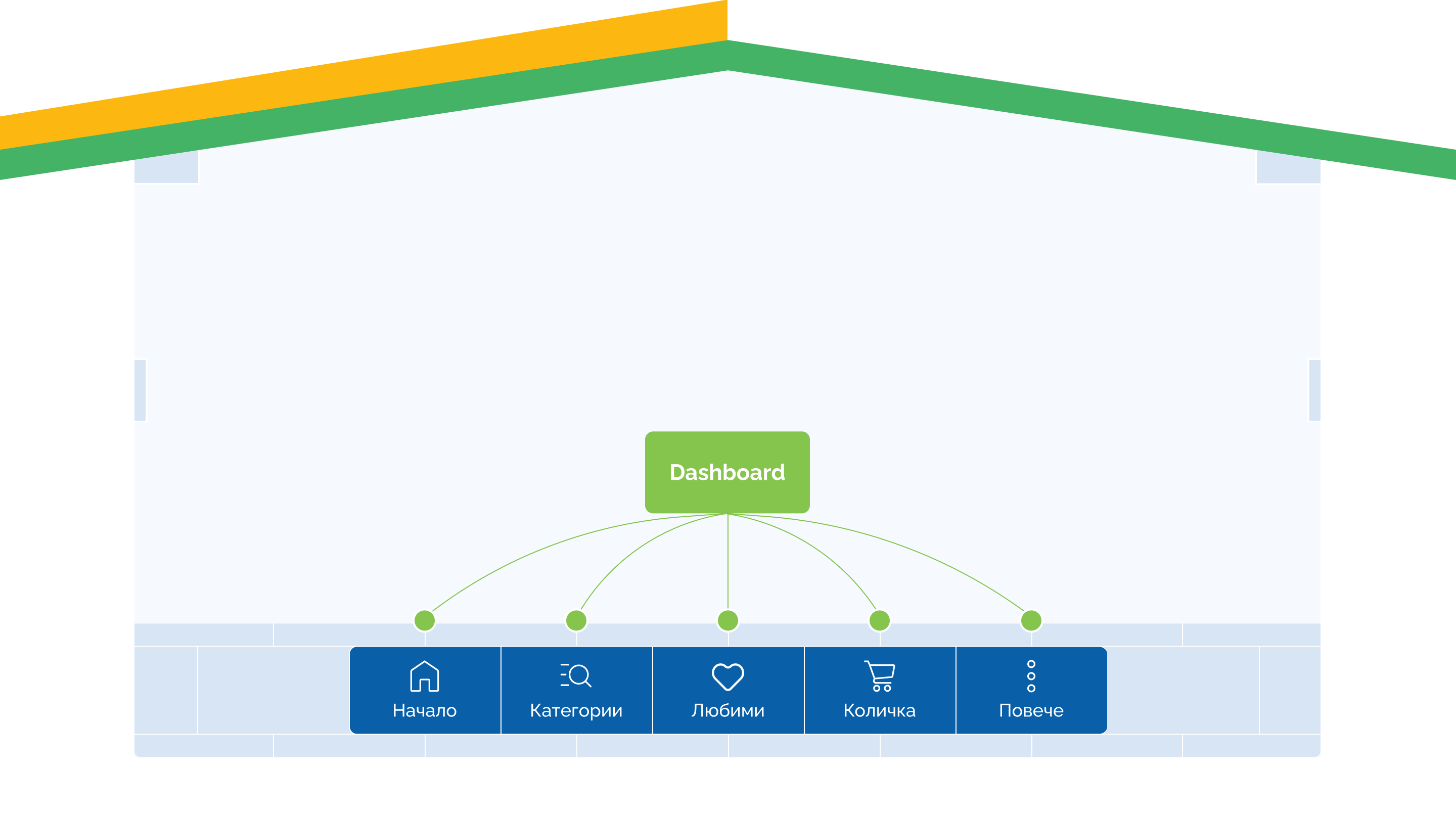
SITE MAP
In the preparatory phase of the project, we developed a detailed sitemap of the application, through which we identified the unique templates, as well as analyzed and optimized user paths.
COLORS
04The colors are the main red, which is accent for the brand and originating from the logo. They are complemented by black -white, beige colors and green for contrast.


FONT
05We opted for the FiraSans Condensed font, which is modern and readable, with a wide variety of weights. It contributes to the clean and minimalist design of the app, while ensuring excellent readability on all devices.


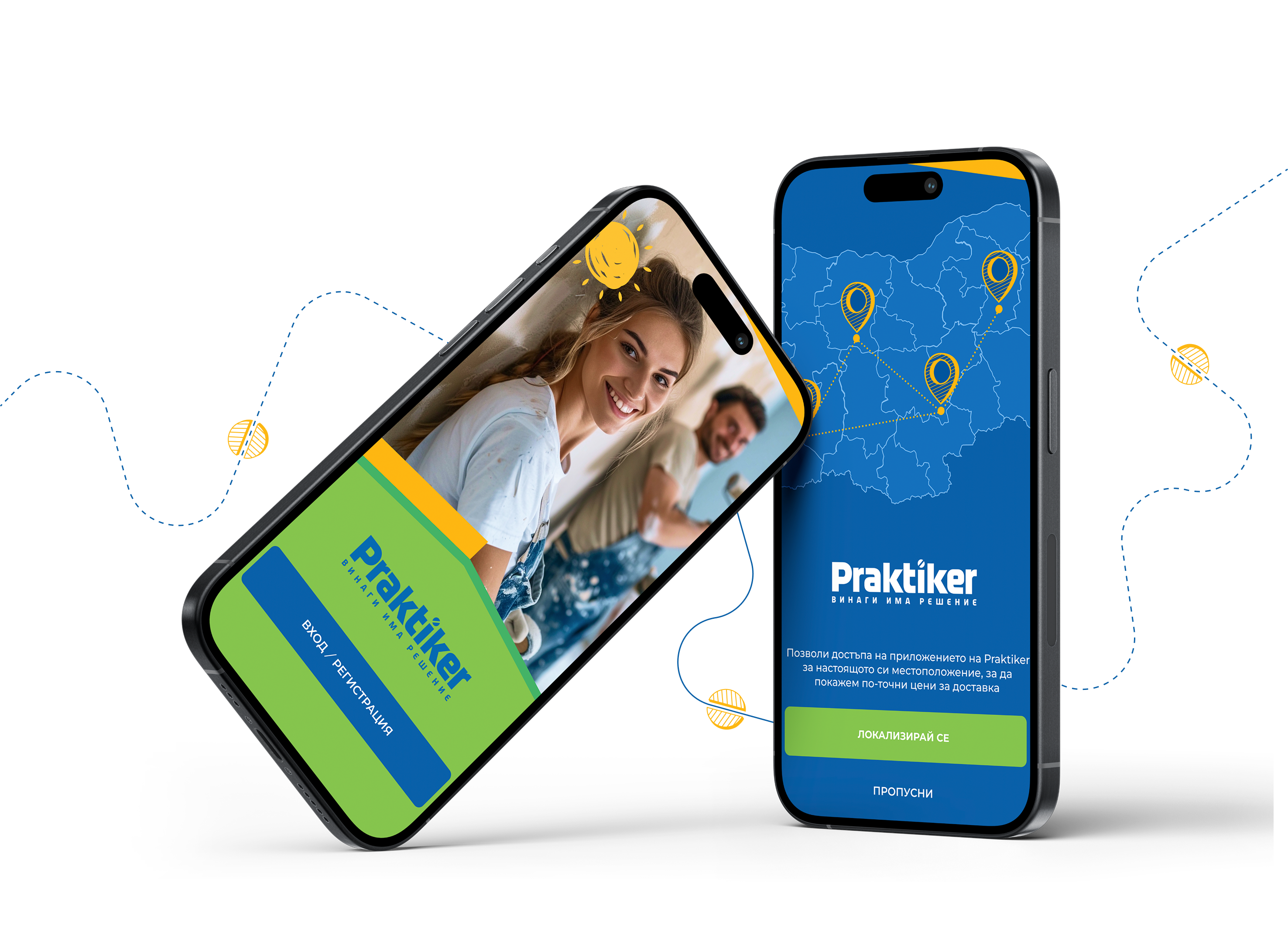
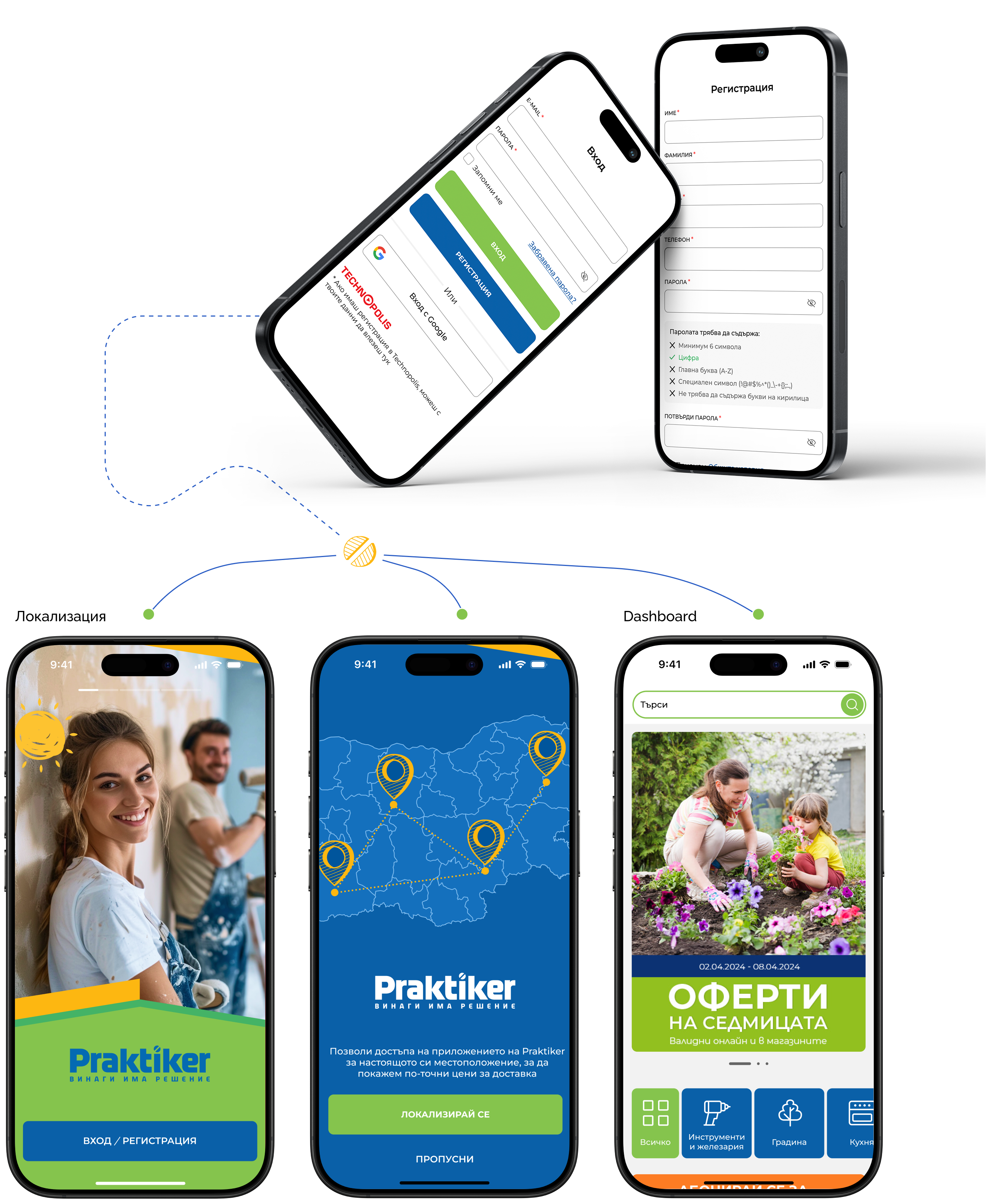
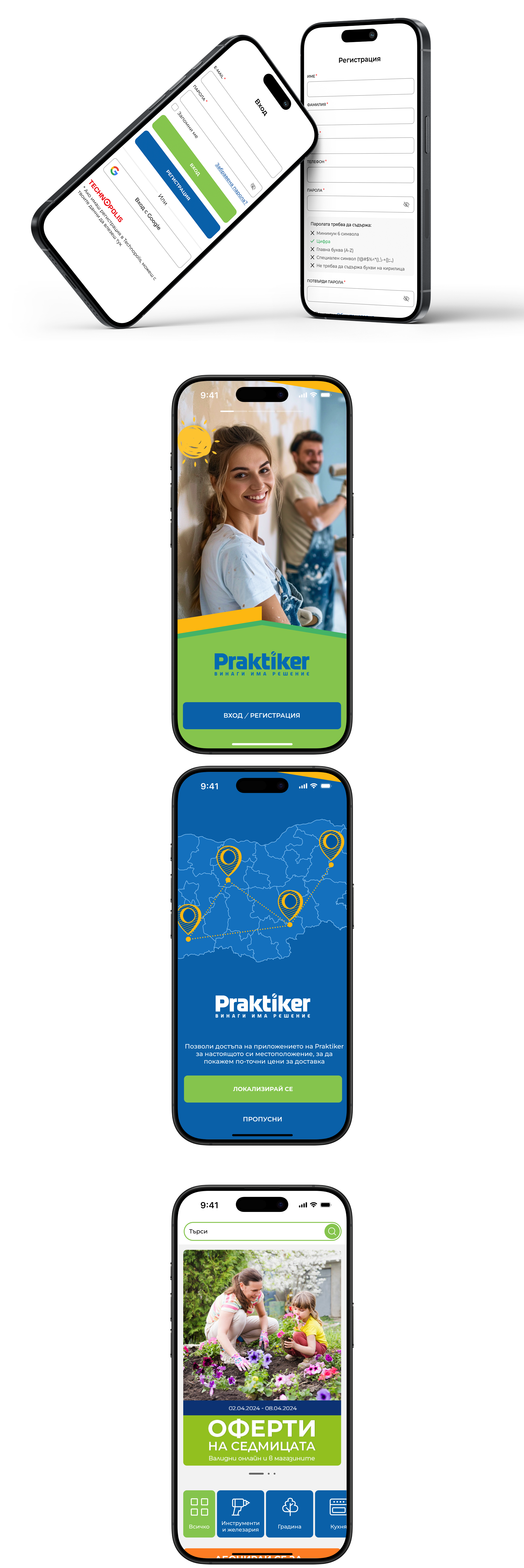
Login and registration
We have created and implemented various ways to log in and register in the application to provide easy and quick access to all functionalities. Users can register and log in via email, Google and Apple, or use their Praktiker registration.
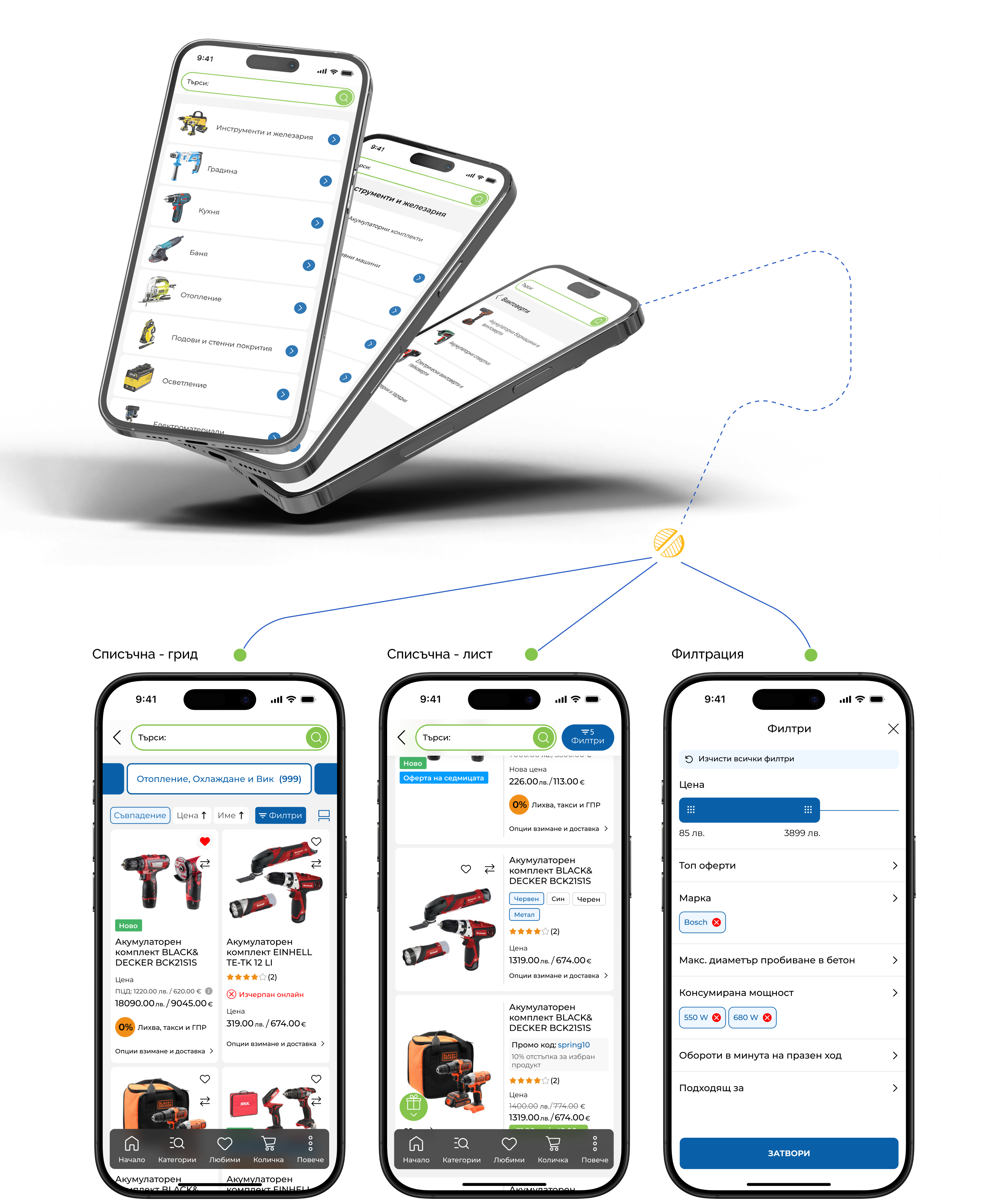
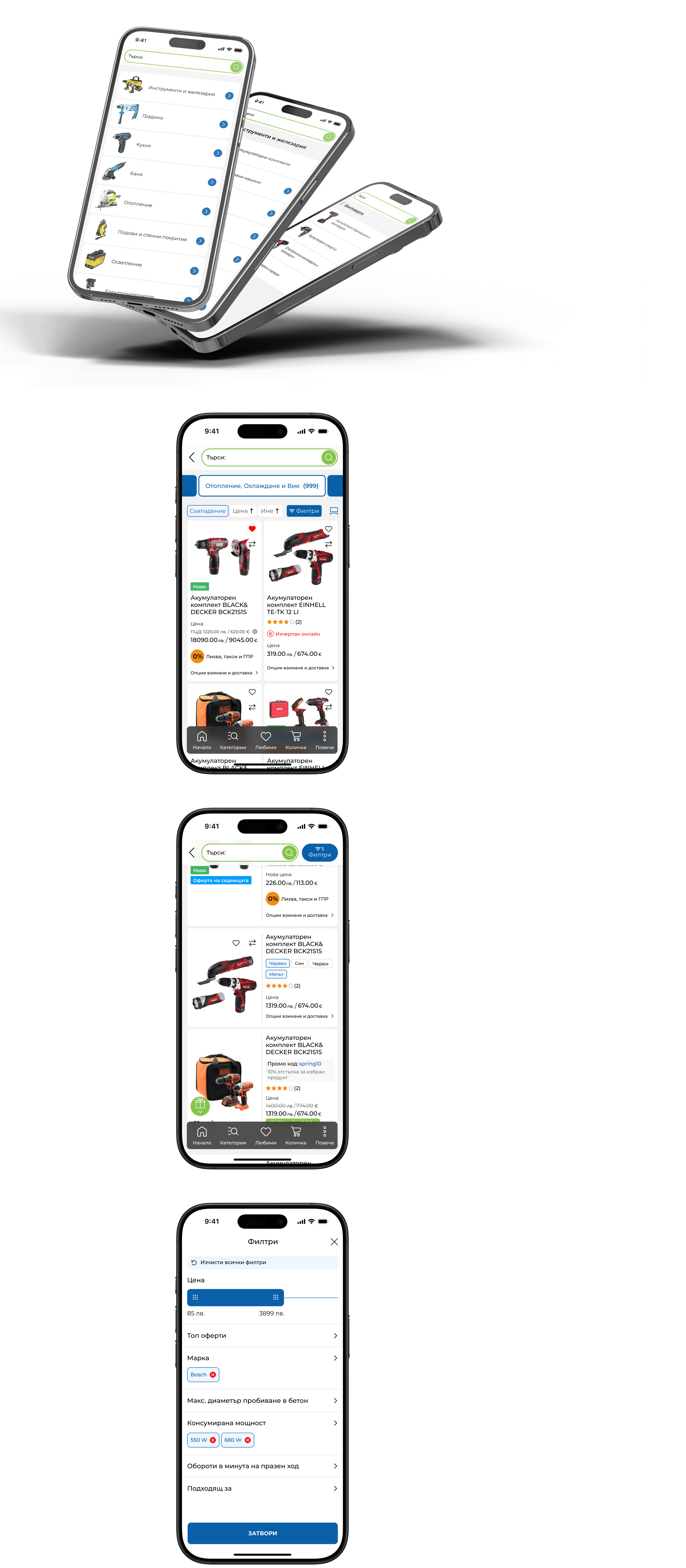
Catalog and list
We created a special "Catalog" section and optimized the list pages to provide users with easy access to all products and categories.

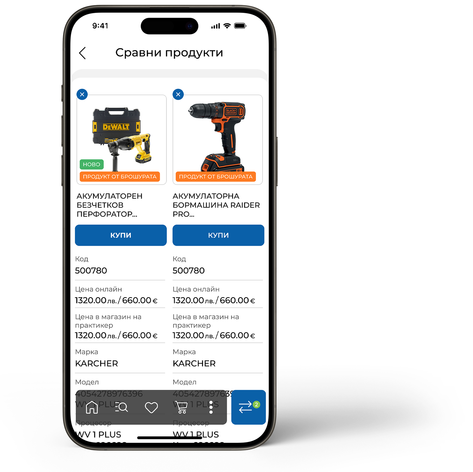
Product page
The product page is designed with a focus on the user experience, providing clear and structured product information, easy access to photos, descriptions and reviews, as well as the ability to quickly purchase.
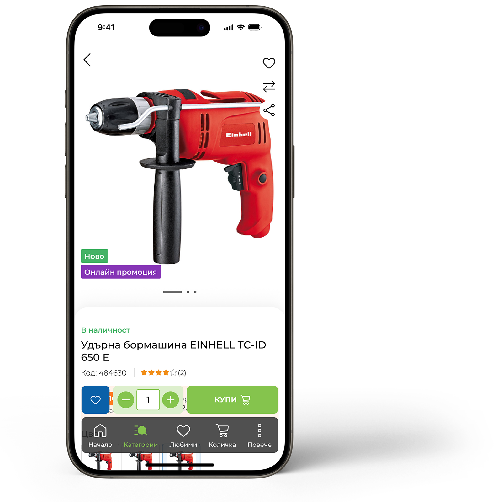
Adding additional services is intuitive and quick. A service can be replaced with just a few clicks whenever the user chooses.
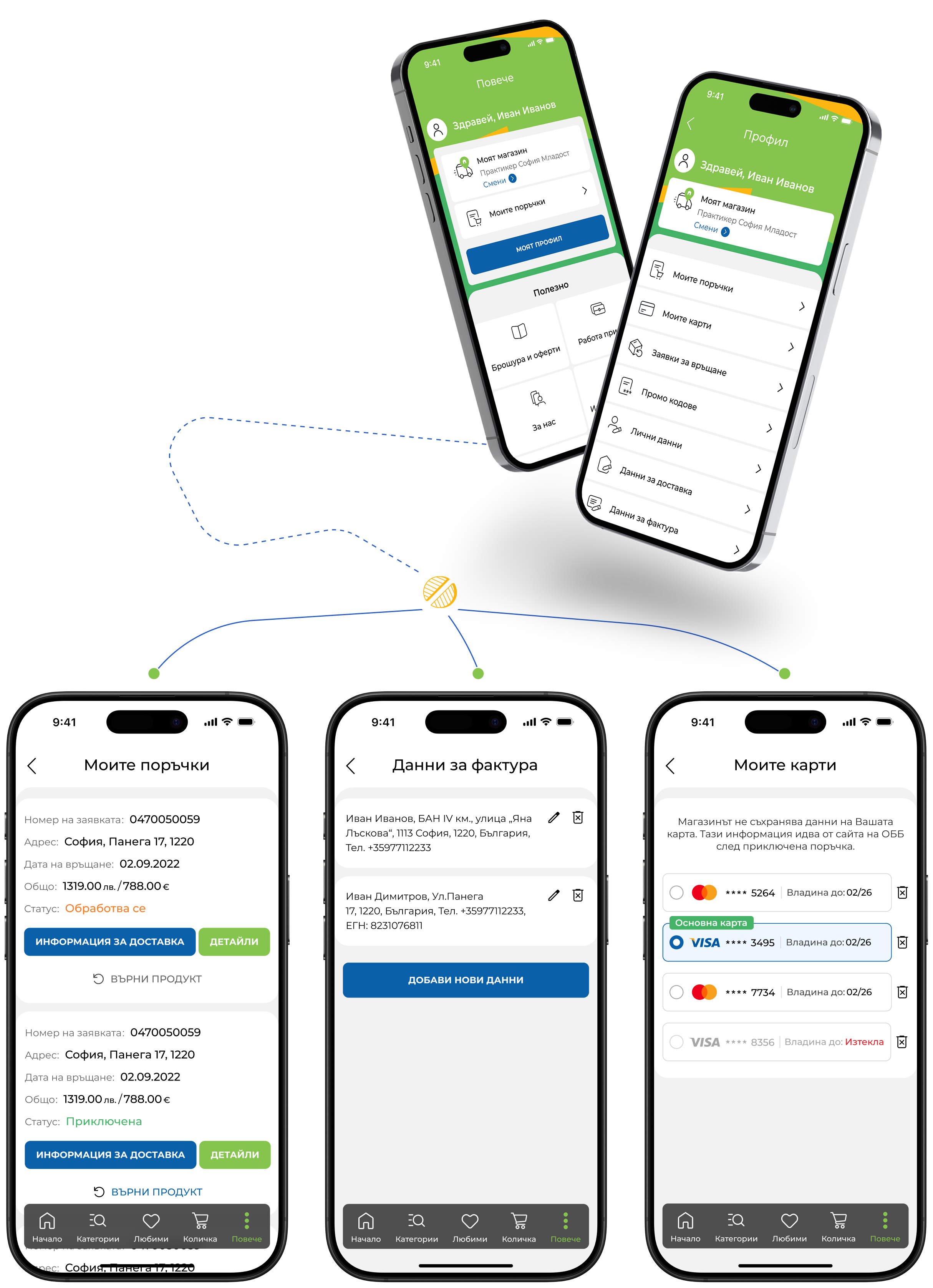
More and profile
The "More" section in the app provides users with access to various features and settings related to their profile, orders, favorite products, and more. It is designed to be intuitive and easy to navigate, allowing users to quickly manage their data and preferences.
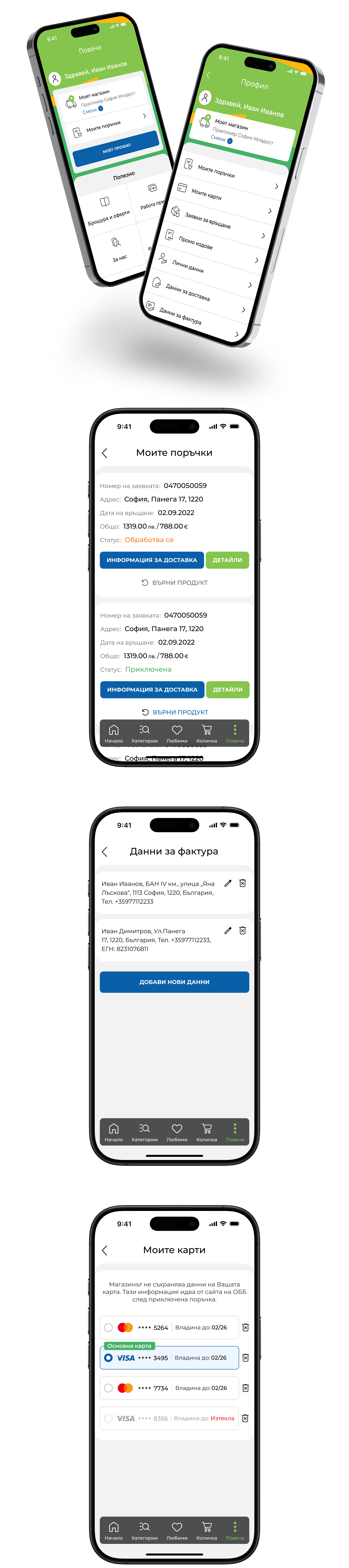

Product page
Internet protection safeguards users from online threats, enabling safe and worry-free browsing.
Adding additional services is intuitive and quick. A service can be replaced with just a few clicks whenever the user chooses.
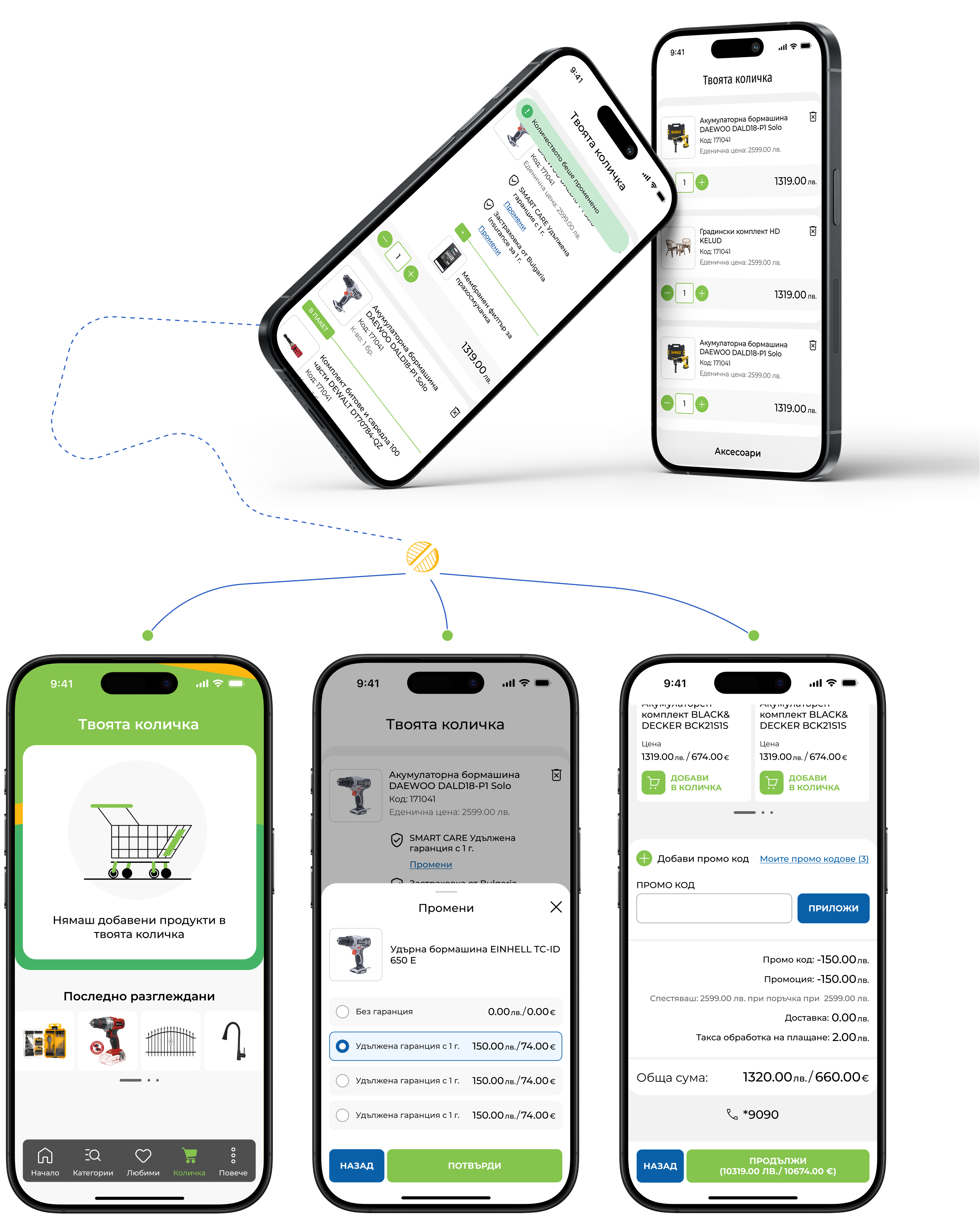
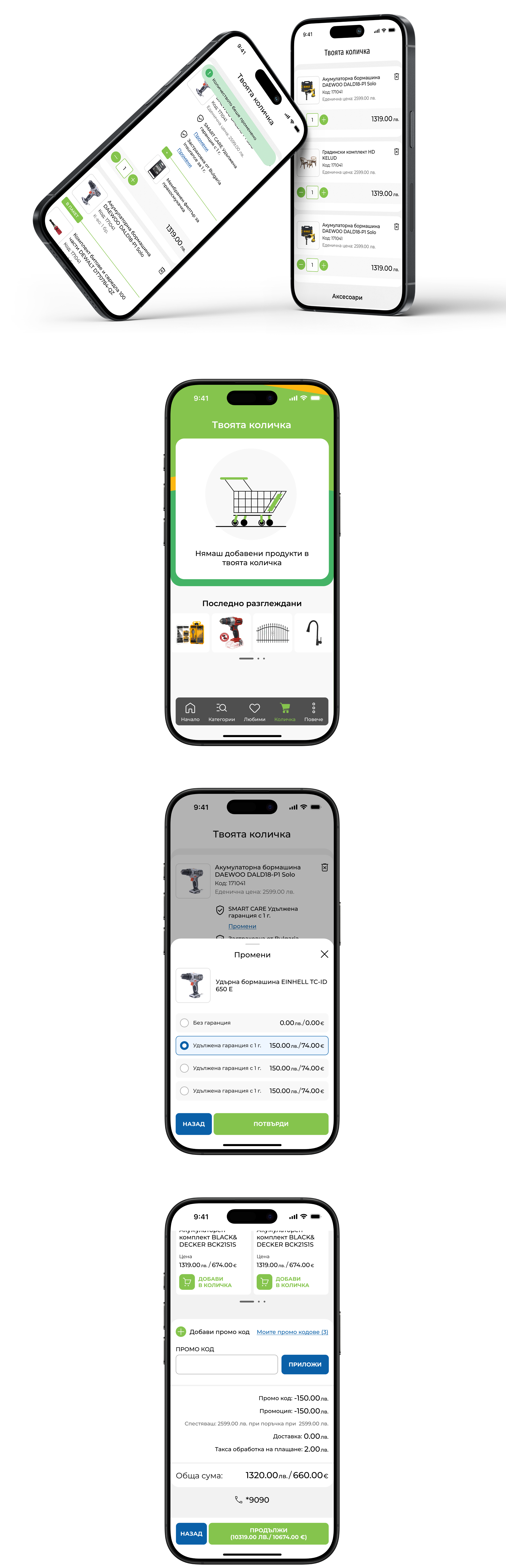
Cart
We have optimized the ordering process by creating an intuitive and easy-to-use shopping cart. Users can easily add products, review their orders, and complete their purchase with a few clicks.
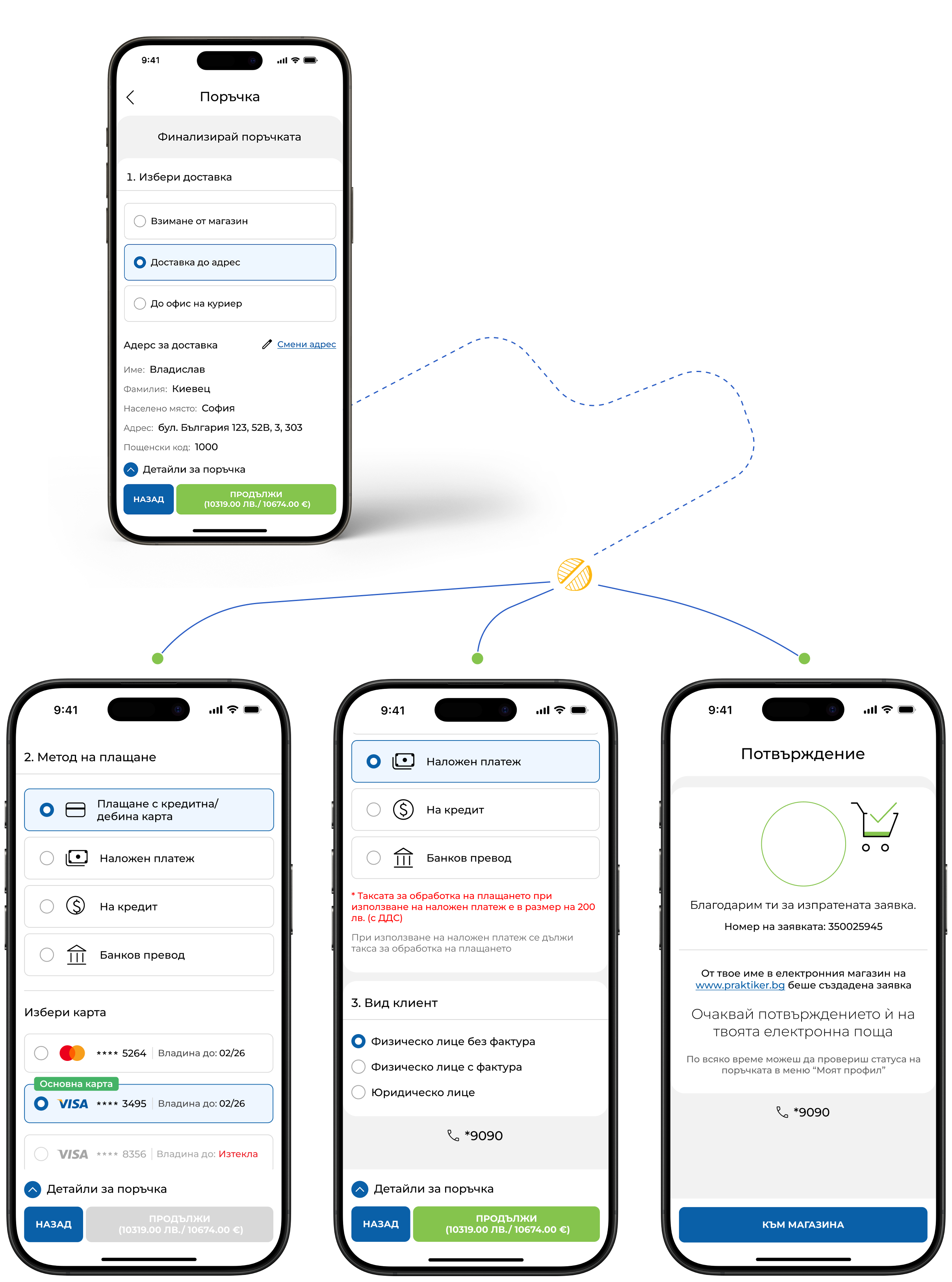
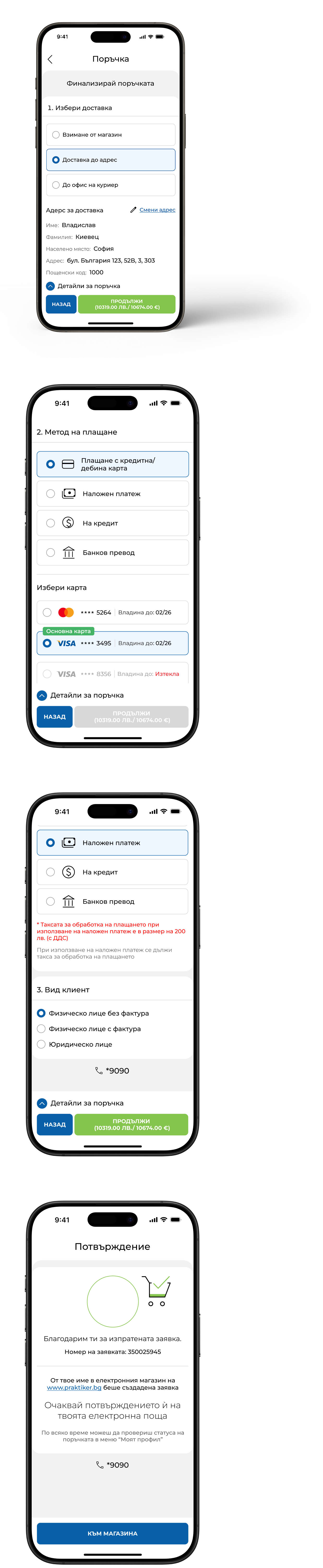
Order
Our application is designed with the user at the center. The ordering process is smoother than ever, offering intuitive navigation, saved details for faster checkout, and clear steps that guide users effortlessly to the final purchase.
I use the Praktiker app and I am very satisfied. It is easy to navigate, I quickly find the products I am looking for and I can conveniently compare and order. It definitely makes shopping easier.