

About the client
In the dynamic world we all live in, Bulgarian-American Credit Bank sees its role as one of the drivers of changing economic models and development policies by integrating the green idea into them. Its mission is to offer innovative financial solutions based on green banking, social banking, and sustainable banking.


Brief
We are looking for a new vision that corresponds to the old one and especially to the BACB brand. With more readability of the elements. We also need new product calculators, a refresh of the administration and more opportunities for dynamic components and flexibility in creating new pages by our team.

Problems
Insufficiently convenient navigation to products, need for a fresher and easier to use for BACB customers. Building a unified graphic line for all sites and microsites of the bank.


Colors
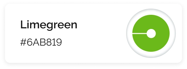
We derived the palette from the bank's logo, but broke it up by adding green and several shades - thus emphasizing the eco and green attitude strongly represented in BACB's policy.


Icons
We approached the icons with a seemingly retro density, which we broke up with geometric thin lines that gave us the necessary detail.
Site map
We derived the palette from the bank's logo, but broke it up by adding green and several shades - thus emphasizing the eco and green attitude strongly represented in BACB's policy.

Design
We mentioned that the site architecture brings together the full range of services and corporate content that a developed bank has. This is exactly what requires well-built guidelines and dynamic components, with which our clients can freely build pages for each new communication through the administration.

Inner pages

Responsive Design
